Case Study
Challenge
Many wedding websites don't provide the bride/groom looking for venues and vendors with up front pricing. This leads to busy brides and grooms spending a lot of time submitting quote requests. Knowing if the vendor/ venue is within a certain price range up front saves time.
Goal
Create a user friendly website that meets the needs of budget conscious brides and grooms.
Solution
This website provides budget minded brides and grooms a way to find vendors and venues easily by allowing filtering by price before requesting a quote.

My Role
UX Designer, Research Designer and Visual Designer
Responsibilities
Conducting interviews, paper and digital wireframing, low and high-fidelity prototyping, conducting usability studies, accounting for accessibility and iterating on designs.
Project duration
January 2022- February 2022
Understanding the user
User Research
I interviewed four users and created empathy maps for them. There were two women and two men. Of these, one user was a Black gay female, one user was a white gay female, one user was a Black bisexual man and one user was a Black cis man.
I discovered that users were looking for a website that was easy to navigate, mobile friendly and that provided easy venue/vendor scheduling and transparent pricing.
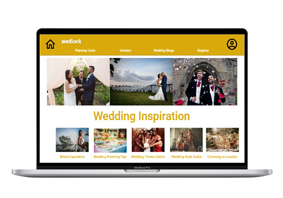
Wedlock Website Design
User Pain Points
Upfront Pricing Model
Users want to save time by requesting quotes for vendors within their budget
Timeline/Checklist
Wedding planning timeline and checklist based on wedding date.
Site Navigation
Users want a site that is easy to navigate so they can maximize their time on the site.
Budgeting
Wedding expenses can quickly spiral out of control, users want a tool for tracking expenses
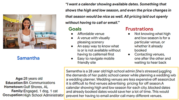
Persona & Problem Statement
Samantha is a busy school administrator who needs a website that offers a responsive wedding calendar/scheduler because they do not want to email or call each venue for pricing.

User Journey Map
I created a user journey map of Samantha’s experience using the site to help identify possible pain points and improvement opportunities.

Starting the design
Site Map
One of the user pain points was site navigation. I planned the hierarchy of the information architecture with ease of task completion in mind.

Paper Wireframes
Wireframes
My goal was to create wireframes for the process of finding a wedding venue that fits the needs of the budget conscious bride or groom to be.
.jpg)
Paper wireframe screen size variation(s)
Wedlock users will access the site using a variety of devices, I created different screen size paper wireframes to assure the site would be fully responsive.


Digital Wireframes (Adobe XD)
Digital wireframes allowed me to refine the designs created with paper. User pain points were addressed by putting the menu at the top and center, making navigation simple and straightforward.
Wireframes

Navigation bar is highly visible.
Section with top wedding planning tips and inspiration
Digital wireframe screen size variations

Mobile
Tablet

Low-fidelity prototype

To create a low-fidelity prototype, I connected all of the screens involved in the primary user flow of choosing a wedding venue and getting a price quote.
My user feedback indicated that I needed to make a few visual adjustments and increase the size of certain icons. I implemented these changes to address these user pain points
Usability study findings
This prototype was used in a moderated usability study with 4 participants. Here are the main findings uncovered by the usability study: My user feedback indicated that I needed to make a few visual adjustments and increase the size of certain icons. I implemented these changes to address these user pain points
Home icon
Two participants felt the home button was hard to find and too small.
Color
A common complaint was that participants did not know which venue to choose because in a digital wireframe ‘pictures’ were dark grey blocks.
Final Screen
Users were frustrated by the feature that required them to return home after submitting a quote. They want to return to the quote screen and request other venues.
Mockups
Before usability study

Before usability study

After usability study

After usability study

Based on the insights from the usability study, I needed to improve navigation by improving the visibility of the Home icon. I enlarged the Home and User icons and made them darker and thicker.
Users were frustrated by the feature that required them to return home after submitting a quote. They want to remain on the quote screen and request other venues.
Accessibility considerations
Typography
I used headings with different sized text for clear visual hierarchy
Navigation
I used landmarks to help users navigate the site, including users who rely on assistive technologies
Final Screen
Using the Adee plugin, I added alt text to informational pictures
Mockups: original screen size


Screen size variations
I included considerations for additional screen sizes in my mockups based on my earlier wireframes. Users shop from a variety of devices. So, I optimized the browsing experience for a range of device sizes.
Desktop

Tablet

Mobile

My high-fidelity prototype followed the same user flow as the lo-fi prototype, and included the design changes made after the usability study.
View the Wedlock high-fidelity prototype

Going forward
Takeaways
Impact
Our target users felt the design was intuitive and easy to navigate through the user flow. The images were engaging and the site had a clear visual hierarchy.
What I learned
I learned that even a small design difference such as color makes a great impact on user experience and satisfaction.
The most important takeaway: user feedback is invaluable for creating the most inclusive and enjoyable user experience.
Next Steps
Testing
Conduct follow-up usability testing on the new website
Ideation
Identify any additional areas of need and ideate on new features
